Saturday, 28 March 2015

Grids.

The 4 x 6 modular grid I was working with was proving difficult to set type to, so back to the drawing board. :)

My initial 4 x 6 grid... there was little options so far as box size was concerned, and the text boxes felt too squashed. :(


My new 5x 5 grid feels much more comfortable for headings and text! I find it works really well with the baseline grid also.


I thought this 7 x 11 grid was really interesting and flexible, perhaps something I will revisit in future. Who knows. :)

I experimented with several different grid options, but in the end the 5 x 5 modular with a 14 baseline grid to match the leading was the most successful for me. Now the annoying part is adjusting all the stuff I already typed up into the new grid format.. ;)


Wednesday, 25 March 2015

Map Progress

So my previous idea for the map ended up being way too time consuming haha, I found there was no appealing way I could quickly do it in that style... again, I would have loved to manually pixel a beautiful pixel art map but alas, time constraints !


I kinda got this far, then realized... when I put in details of other buildings and stuff it will look busy and crap, so I went back to my original idea of a simpler, pac-man ish map.


I felt this one was far simpler and better designed, it also fitted my grid far better and conveyed the information in a clear manner.


Sunday, 22 March 2015

Moods

Because of the game concept and layout for my spreads, this allows me to potentially include a "mood" bubble of the protagonist as part of a game-like user interface, and I thought it might be fun to have him portray an appropriate mood for each location -- the mood one might feel while engaging in each activity.

Lineart.


Colored version.

Very roughly done heh.. I used the unique color palette for each location as well so that they would fit the composition/mood of the overall spread. Anyways it's just a fun feature and having it included is a symbol that gamers would be very familiar with as a lot of games include a portrait of your character in the user interface along with other relevant information like experience, level and so on.


Saturday, 21 March 2015

Game Map Research

I decided to do a bit of research into game maps to get an idea of the style I will do mine in. I kinda wanted to do mine like a minecraft-esque isometric 'chunk' view... this is a style that I have seen in a lot of game maps, or at least very similar perspectives. :P


So basically a view looking down similar to the image above. But showing buildings, and the essential street info of course (possibly a few well known landmarks too as a point of reference)

While doing this in pixel art would be more true to a retro gaming style, due to time constraints I will just be whipping it up using solid cell shading. lol

I gathered an assortment of cool looking maps/images that I really feel convey the style I am going for...


This map was used in the game Super Mario World. :) It uses a colorful and illustrative style and shows a map with great diversity in location and mood.


Perfect example of isometric view, though I certainly wont be able to include quite this level of detailing haha. All the details and different colors in the scene really get across the active feel of this urban artwork.


This is a really good example by the same artist, it shows how buildings might look in an isometric style. The map I am going to make will be a rather compact chunk but I was thinking I would add more detail to the spots where the locations are.


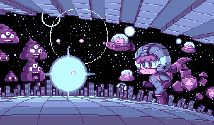
This artist has recreated a town from well known game series Pokemon in an isometric view. This is sorta like the size I am going for, although the scale of the objects in it will be smaller due to the amount of streets and buildings covered in the area.

This one is ideally what I am aiming for. Although I doubt mine will match this in skill or accuracy. :) I really like how they added depth by including underground carparks, fossils in the soil and making it look literally cut away like a slice of cake.

Funnily enough, the isometric chunky style reminds me a lot of MC Eschers work in that it shows an unrealistic amount of information due to the use of perspective... But I digress. :)


Relativity by M.C. Escher


Friday, 20 March 2015

Artwork 3

The final spread illustration. Pulsar Max is a much more quiet environment, and the color palette was alot more subdued. The card games are also a much more intimate and "logical" experience so I tried to convey this in the elements of the illustration. In the other spreads the protagonist is visible but I decided for this spread, YOU are the protagonist (to convey that intimacy..) so I added cards in the bottom right, with a thumb in the area where you might typically hold the page when you turn it. :) The cards feature patterns of some of the abstract adjective patterns and cropped drawings I did during the research process.


The background is simple and muted, ordered and logical. It matches the repetition of cards, comic books, shelving in the store. I drew the ultimate nerd boss as having multiple heads to emphasize the sheer brainpower he possesses in a literal but fun manner. ;)

Thursday, 19 March 2015

Artwork 2

Here's another of my spread illustrations, this time for laser tag. Continuing with my portraying each location as if it were a video game theme, I decided to make the area infested with evil laser shooting spiders that lurk in the shadows...


The dark color scheme came out so well ! the background has a starburst like pattern which I came up with during my abstract pattern phase, I feel it really represents the concept of the area well. I also used quite a few design concepts here.. the use of warm colors to create hierarchy, the diagonals to lead your eye right down to the protagonist and also pattern/repetition to lead the eye around the page, and I used scale to get across the frantic feeling of the game, you feel very small when you are running around that dark maze not even knowing where your foes are hiding. ;)

Wednesday, 18 March 2015

Artwork 1

One of my completed artworks for the Arcade spread. Kinda a lot different than the concept piece I had posted earlier. I worked a lot on getting the fun mood of the area into the art work, the colors were not too tricky to work with despite being limited to the palette I hand picked from the research photos. There are several of the abstract patterns used in this (the circles in the background, the grid pattern on the arcade machine etc.) I realize creating a fictional 'story' like portrayal for each area kind of stretches the reality of the spots a fair bit, almost abstracting it away from what it's reality is. But isn't that the point of games? And that is what I was trying to convey in my brochure. The sort of alternate reality people experience when playing these games, where things are not as they seem but rather a whole different world entirely. Only gamers can fully appreciate this concept. :)


Tuesday, 17 March 2015

Palettes.


I used eyedropper tool in my research images to get color palettes for my drawings to make sure they are cohesive with each area.

The laser force colors are a mix of bold bright colors and dark colors, I will use the dark colors and add accents with the bright ones to get across the dark aspects of the location and need to sneak about the place.

Pulsar max has some muted tones, as it is the more quiet and intimate of the activities i found this fitting. I will be basing this artwork around the calmer lighter colors like like grey and teal.

Lastly, Time out has energetic, vibrant neons. This captures the fun element of the location, the bright lights, flashing games and busyness.

Monday, 16 March 2015

Testing color schemes

I did some really quick whimsical little doodles just to test that I could actually feasibly draw each location out using the color schemes that I had for them... so far so good. :)


Sunday, 15 March 2015

Headings

I searched up a bunch of potential fonts to use in the brochure, they are all game themed, pixel or sci fi ish fonts. I wanted something simple that conveys that almost retro style that arcade games often have. On top of that I found this amazing tutorial to turn that font into pixel-effect blocks with actual depth in illustrator and I feel this will add to the strength of my concept and execution.


I also tried an alternate color for the headings to experiment, as I want them to fit together well overall but still be reflective of their respective location by being directly from that locations color palette. (I literally used eyedropper tool in illustrator to grab the colors)

Saturday, 14 March 2015

Fonts & Headings.

This is sorta the direction I was wanting to go in for the cover, text wise (I will be adding image behind this text, like the/title screen of a video game). The use of the pixel fonts gives immediate connection to arcade style/8-bit video game systems, so I decided to go with those for the headings in the brochure. I have yet to decide if white on black or black on white text will look better... I will have to do tests. :)


Below is a range of fonts I have considered for the headings..

-will edit these in later-

Friday, 13 March 2015

Art Inspirations.

So I spent some time researching game/cartoon artists (because these art styles are obviously directly relevant to my topic...) and their various styles for some inspiration to the direction I may take the images in my brochure. I want something quite bold, cartoony and contrasty for the most part, inspired by game promo art, box art/posters, pixel art, sprites etc.

This artists work is very pixel based, they use color tones to further emphasize the moods within the areas depicted in the artwork. i.e. a rundown factory with a muted color palette gives off that gritty, industrial feeling.


I really love the use of symmetrical balance in some of these works, the overall composition being triangular also adds a sense of stability to these compositions despite being very high in contrast or very colorful. They are literally eye candy to look at for me.

Saturday, 7 March 2015

Week 2 pt 2

After going over my topic in class and doing research (going out and taking photos, talking to people, playing games at the locations etc.) I am really confident about my idea.

When I was taking photos, my phone kept glitching! So annoying but the images are kind of pretty? I think I might work them into the compositions in some way, as they look very digital and vibrant and really fit the mood I am going for in the overall-umbrella theme of the brochure.


A few concepts I am toying with:

I hope to make my brochure to be fully game/nerd inspired, and go into a lot of stereotypes and language etc. as if the brochure was describing each location and experience as a different level or prologue to an actual game. I am aiming the brochure toward people with an interest in gaming and nerd culture.

The artwork will be colorful and similar to game artwork, but i will try to make the colorschemes etc. fitting and relevant to each location by getting swatches that match colors found at the locations and fit the mood of them etc.

I was thinking that perhaps each area could have a "boss" in it, as that is something that is basically in every single game. Totally something gamer nerds like my self can appreciate or would find fun. The "bosses" can come in many forms but I will make them using objects, patterns or things unique to that location. I guess in a way it is like personifying the location haha.

For one of the keys are the bottom I wanted to add an experience bar, or 'xp' bar along the bottom which would increase with each location/page, with the final most nerdy experience of the lot filling up the xp gauge.

Here's an example I found on google:


I'm really excited because this is going to be fun. :D

Tuesday, 3 March 2015

Week 2

So after toying with several topics, I settled on doing a brochure about geek/gamer type spots in Wellington. :) This topic is quite relevant to my interests and I have a lot of places in mind so it should be engaging and fun for me! My strong point is illustration so I was hoping to do a sort of colorful, game-esque type art for each of the spreads.


LOL.